Arrangr Product

A Scheduling App for All Your Needs

Arrangr is a leading player in the calendar and scheduling business, providing a range of features to help customers manage their meetings with ease. From scheduling a 1:1 meeting to creating a poll, Arrangr offers a user-friendly and efficient solution. With a focus on user experience, Arrangr was keen to revamp its web application and turned to our agency for help. We were tasked with evaluating and improving the application to create a better experience.

Services

  • Digital Strategy
  • Product Evaluation
  • User Interviews
  • User Journey Mapping
  • User Research

Project Type

  • Embedded Agile Team
  • Product Design
  • Product Experience Design
  • Product Innovation

Streamlining Scheduling and Improving Arrangr's Web App

Our team at Lion set out to enhance Arrangr's web application, which facilitates easy scheduling of appointments, meetings, and polls for individuals and teams. We identified pain points and redesigned the UX and UI to create a smoother and more efficient experience. Our project involved devising a strategy, conducting research, performing a thorough heuristic evaluation of Arrangr's application, revamping several key flows, and enhancing the visual design for a modern, consistent look and feel.

Identifying Areas for Improvement

Key Challenges and Pain Points

During our analysis of Arrangr's web application, we identified several pain points that were causing frustration and confusion for users.

  • Complex Navigation and Onboarding

    Users reported difficulty in finding the features they needed and understanding how to use the application's many features. The onboarding flow was also unclear and lengthy, which was a key area of friction for a new user.

  • Inconsistent and Outdated User Interface

    The inconsistent user interface (UI), coupled with outdated design patterns, led to cognitive overload and confusion, highlighting the need for a more modern, scalable, future-forward UI.

  • Confusing Terminology and Mismatched Mental Models

    The application used inconsistent and confusing terminology across different flows, leading to user confusion and making it challenging to understand the system's functionality.

  • Disconnected Flows

    Several flows, such as creating a booking page or scheduling a 1:1 or group meeting, were disconnected from one another and required too many steps, resulting in an inconsistent and poor user experience.

Optimizing User Experience

Key Findings from a Heuristic Evaluation

During the heuristic evaluation, several UX issues were identified, such as the lack of consistency in the user interface and the need for a modern design. The evaluation also highlighted the importance of providing clear and concise feedback and information to users. Improving the onboarding flow and reducing the number of steps required for completing tasks were also identified as critical areas for improvement.

Understanding User Needs

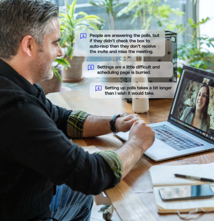
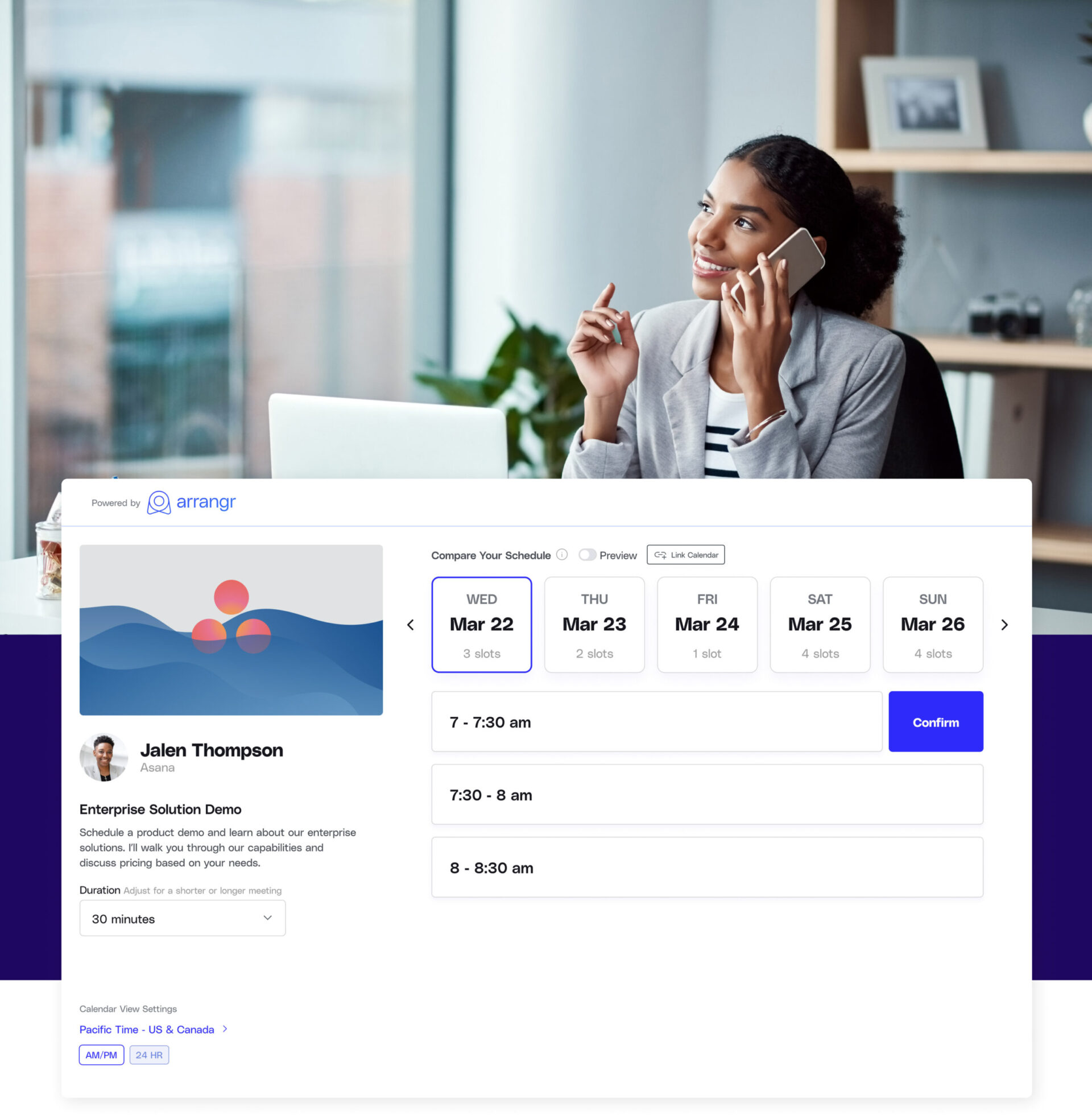
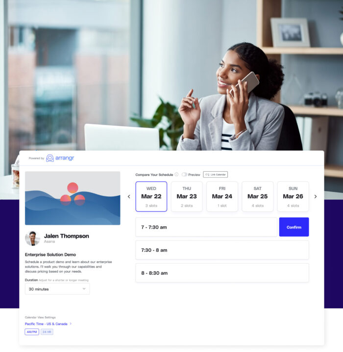
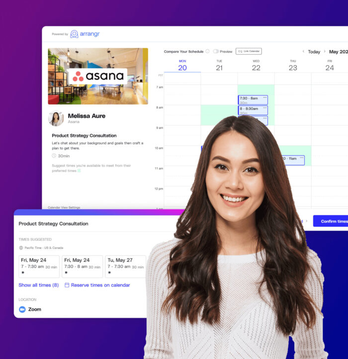
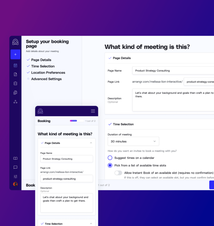
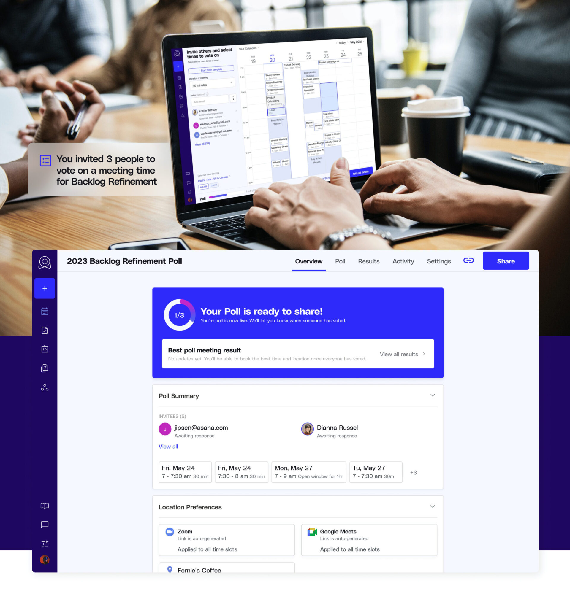
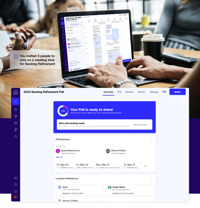
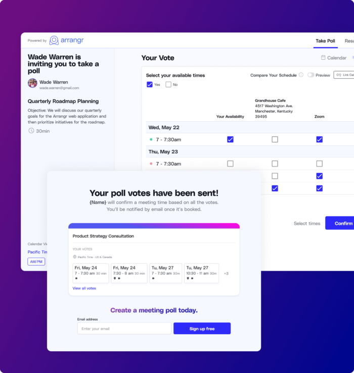
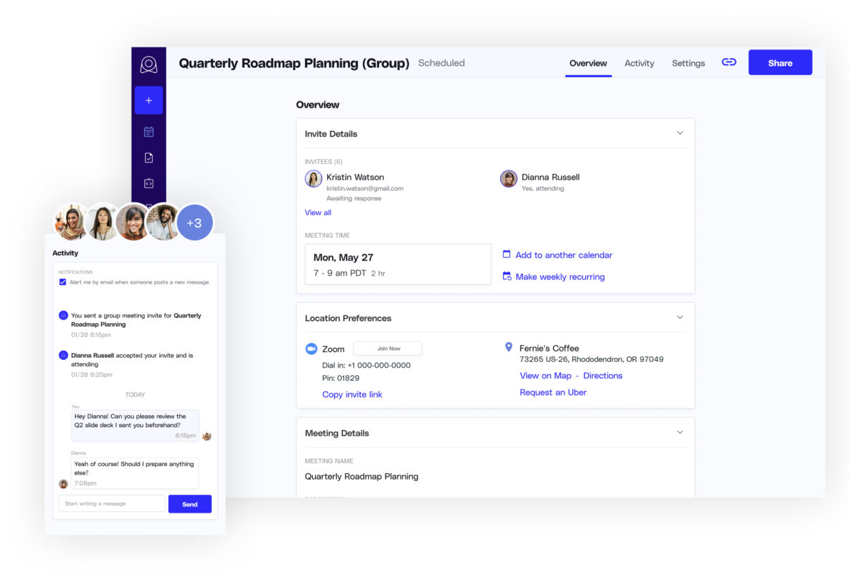
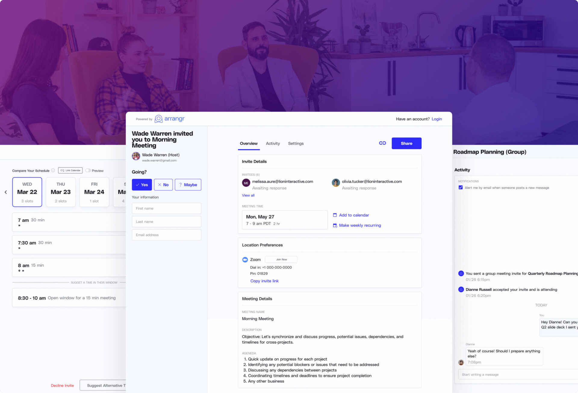
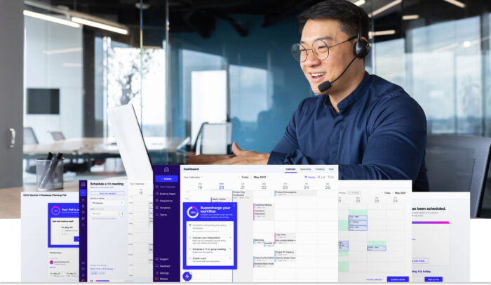
Improving Usability and Efficiency for Seamless Workflows

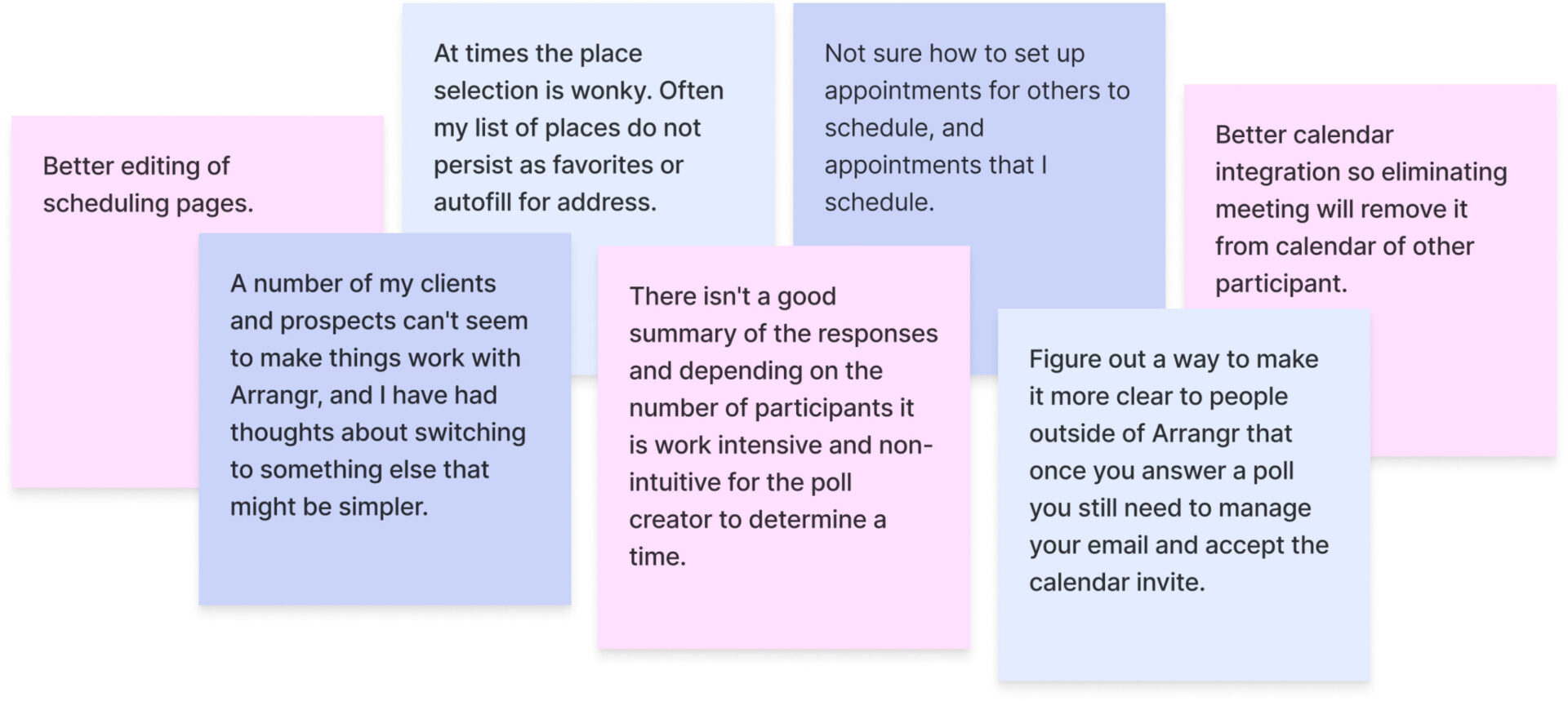
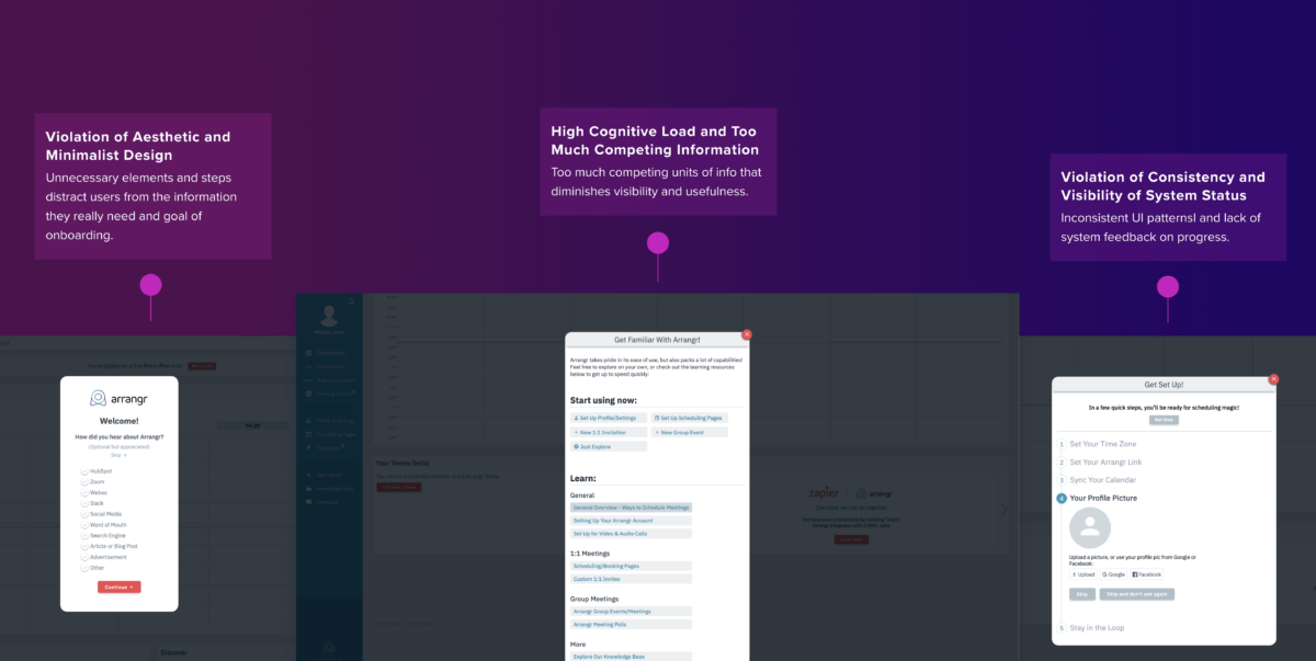
User feedback highlighted strengths and weaknesses and provided ways to improve the user experience, specifically around improving usability, visibility of features, and time to complete of a task for various flows like creating a meeting poll, creating a booking page, and setting up group meetings.

Simplifying Onboarding

Reducing Cognitive Load for an Intuitive User Experience

After evaluating the onboarding process, there were a few key issues we wanted to focus on to reduce cognitive load and to improve the overall user experience.

  • Streamlined essential steps and reduced cognitive load

    Our goal was to prioritize the main task, eliminate unnecessary steps, and simplify the onboarding process for users.

  • Enhanced visual and typography hierarchy for better guidance

    We used typography and visual cues to create a clearer hierarchy and guide the user through the process.

  • Ensured consistency throughout for a more user-friendly experience

    We reviewed the placement and labeling of key call-to-actions, differentiated between primary and secondary actions, and provided clear confirmation of settings.

Seamless Onboarding Redefined

Prioritizing Speed and Value for Optimal Experiences

Our seamless and simplified onboarding flow focused on creating a user-friendly interface that ensured a smooth and speedy experience. We prioritized value by providing clear and concise feedback, reducing cognitive overload, and minimizing any unnecessary steps or actions throughout onboarding.

Unlock the Full Potential of Arrangr

Embrace a Quick Checklist for Optimized Onboarding

We implemented a checklist as part of the onboarding process to help improve the user understanding of features and functionalities. Our goal was to increase engagement while reducing frustration caused by confusion or missed steps.

Modernizing Booking Experiences

Streamlined Design and Clear Guidance for Effortless Interactions

We modernized the design of the booking page, making it more scalable for our users to share, improving navigability, and simplifying the flow to reduce confusion. We also reduced the number of steps required to complete bookings and provided clear instructions for users.

  • Streamlining the user experience and improving clarity

    We removed repetitive steps and conflicting actions, and provided clear instructions to guide users through the process so they were no longer confused or frustrated.

  • Improved the visual design and hierarchy for better guidance

    We established a clear visual hierarchy and page structure and used appropriate colors for CTAs to improve the user's understanding of the process.

  • Enhancing flow continuity and speed

    We redesigned the flow to reduce interruptions, allow for easy and quick navigation between steps, and ensured that integrations are clearly labeled to avoid confusion.

Simplify Your Booking Process

Hassle-free Pages for Organizers and Invitees

Our goal when redesigning the booking pages was to simplify the process for both organizers and invitees, reducing friction and ultimately making the experience more seamless. We designed clear and concise labels, intuitive UI components, and efficient workflows to ensure hassle-free bookings for all users.

Engage and Upgrade

Monetize with Ease through Enhanced Visibility and User-Friendly Upselling

We made it easy for organizers to edit booking pages seamlessly across multiple devices, ensuring a consistent user experience. Invitees could also now easily view and interact with booking pages on any device, leading to increased engagement and bookings.

Engage and Upgrade

Monetize with Ease through Enhanced Visibility and User-Friendly Upselling

After evaluating the onboarding process, there were a few key issues we wanted to focus on to reduce cognitive load and to improve the overall user experience.

  • Improved the UI/UX design for better visibility and consistency

    We reimagined the entire polling UX, improved consistency in UI patterns, and redesigned the visual hierarchy of elements to improve usability and ease-of-use for our users.

  • Increasing convenience and efficiency when creating a poll

    Our goal was to minimize the number of steps and reduce the cognitive and motor load needed to create and monitor a poll because our users expressed how complex and tedious the process was.

  • Improved monetization efforts with a new paywall and upgrade visibility

    Prior to our redesign, opportunities to upgrade were not visible which limited their monetization capabilities. We added visibility into which features were Pro+ and designed an engaging and user-friendly upselling/upgrade experience.

Streamlined Poll Management

Enhancing User-Friendly Interactions and Effortless Voting

We have made poll management and voting more user-friendly by simplifying the interface and providing clear visual feedback. By refining the workflow, we were also able to reduce the time it took to create a poll and schedule a meeting. Users were now able to easily create and manage polls while also view the results in a clear and organized way.

Efficiency Redefined

Creating 1:1 and Group Meetings Made Effortless and User-Friendly

We enhanced the experience of creating 1:1 and group meetings by streamlining the scheduling process as well as improved the hierarchy across several parts of the flow for a seamless and easy-to-navigate experience.

  • Improving visibility, navigability, and hierarchy for ease-of-use

    We simplified the design and improved real estate and hierarchy to reduce confusion when navigating the flow. We also provided clear feedback and visibility of the user's progress so they could easily know where they were and be able to navigate between various steps.

  • Streamlining creation and improving the UI for efficiency

    We focused on improving the UI to increase efficiency by reducing the number of clicks and steps needed to create a 1:1 or group meeting. We also optimized for speed and value by making it easier for users to input meeting details in one place.

  • Improved consistency across the flows

    Although these flows were similar, they were made up of different interactions and UI patterns which made each flow more difficult to learn and complete which is why we designed with scalability and consistency in mind for a more seamless experience.

Streamline Your Schedule

Effortless Scheduling for Busy Professionals

The UI was redesigned for consistency and to enhance efficiency and reduce the number of clicks and steps required to create a 1:1 or group meeting. Additionally, inputting meeting details became easier with optimization for speed and value by enabling organizers and invitees to provide details or view details in one place.

Made with Love
in The Bay Area
We're an award-winning interactive agency specializing in digital applications, user experience design, marketing-driven funnels, and brand strategy.
Facebook